Thursday

Annual Report

I'm very excited to be able to post the link to this

annual report

that I created. It was my baby as I nursed it through absurd text, gave it a concept and developed the illustrations, photographs, and layout.

I am very happy with the way this turned out. I think it's eye catching and it really captures the essence of the amazing growth the agency has gone through in the past year.

Wednesday

Artwork

My degree is a Bachelors of Fine Arts and my major was Graphic Design. For the first two years of art school we studied the basics such as drawing, painting, and sculpture. Then the last two we focused mostly on design. (We weren't allowed to use the computer in our first design classes, instead learning the old fashioned way.) I started painting again once I had the space to set up an easel. The following are some of the projects I am working on.

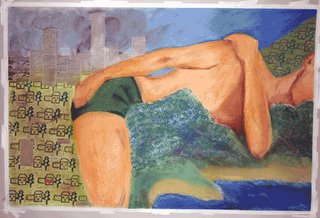
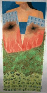
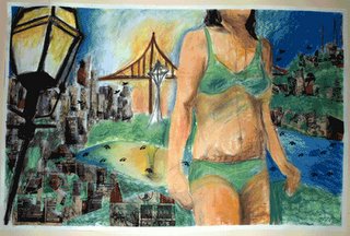
This is a triptych of large pastels in the order they were created. The first started out as an amalgamation of sights from various trips I had recently taken and Seattle and turned into more of an enviromental piece. Using newspapers for buildings made them seem dirty and evoked the damage that large cities can unleash on the enviroment. I explored this theme further in the next pastel. The figure lying down symbolizes that each individual is either a contributer to pollution and enviromental disasters or a protector of nature and ecosystems. The houses in their neat rows symbolize the inorganic way that man sets up his grid and spreads out eating up land. The final piece shows that despite the neatness and perfection of our rows of houses, we find ways to self-destruct. The houses are broken in two and 'milagros' litter the ground like charms for loved ones that will never heal or reappear. In all three the figure serves to remind us that we are all responsible and that even one person can make a difference.


Monday

Brochure Design

The following is a link to a Brochure I designed for a Pharmacy Residency program. Some of the difficulties included balancing a large amount of text with the amount of photographs (which I took with a digital camera) requested. I designed the brochure to appeal to the mature student who has just finished a PharmD (post graduate) program. The result, I believe, is a friendly, accessible brochure with a lot of good information and photographs that draw you in and show the atmosphere of the Pharmacy.

Click here to view the brochure

I've also recently completed a brochure for the Organ Donation Transplantation program. Organ Donation is a tough issue in Asian Communities. Asian cultures, typically, do not like to talk about issues surrounding parts of their bodies. However, studies have shown that if you show it in the light of helping members of their community, they respond well. The brochure was designed to highlight photos of community members and also make the information as non-scary (for lack of a better word) as possible. Also, the bright colors draw the viewer in to pick up the brochure and the illustrations I created are meant to make people feel comfortable about the subject.

Click here to view the brochure
Sunday

Print Design and Communication

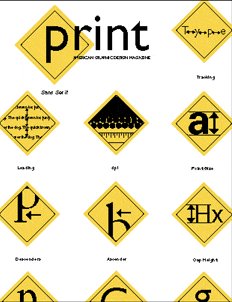
This is a cover I designed for Print Magazine's student design contest. I came up with the concept of communication at its most basic level (traffic signs) because that is, I believe, what graphic design should be all about, communicating a message or concept simply and clearly. The traffic signs in this cover express basic elements of design including leading, serifs etc.

Saturday

Poster Designs

The following are examples of some posters that I had designed over the years for film festivals, plays, and art exhibitions. In many of them, I used my own images.


Past work

The following are some advertisements I designed for a project on the Boston Architectural Center. The unconventional text creates the illusion of architectural elements and in one stroke draws the viewer into the ad.