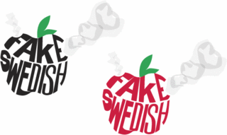
Not being tapped into the culture that Fake Swedish reside in, I am having a difficult time with the logo. Previous incarnations were cool, but feedback was that the lead singer is uncormfortable with his image being in the logo (instead of the whole band) and that it is not quite psychedelic enough. He wants something that you can get high looking at. Other logos were too cookie cutter and perfect. Apparently, his fav. image is from the bands website. A local artist made a poster for them with their name in smoke. At first I tried to copy this look, but being a bit of a purist, I was getting stuck on ruining the perfect lines of an established typeface. Weirdly enough I came up with the following idea when researching another logo transition on the IBM website. It gave me an idea that probably would have made the logo artist turn in his grave (assuming he is dead). Here is the image and I'll explain below:

I decided to jump right in with references to smoking anonymous substances. Originally, I started with a stylized bong shape and then jumped to and apple bong. I had to look up on the internet images of apple bongs and then a website that tells you have to make an apple bong. Unfortunately, the people I have shown this to do not recognize it as such. However, they are not into smoking paraphanalia and so that is understandable. I like this logo because it takes something wholesome and turns it into the opposite. When I see pictures of Fake Swedish, the lead singer is wearing a dress shirt and tie. I imagine him, pre-rock show, as a nice, well-dressed young man, someone you can take home to mom. But as soon as he steps on that stage, whatever images you have in your head of him do a 180.

