Sunday
Website in Progress
I am currently in the process of creating a personal website. More details to come.
Tuesday
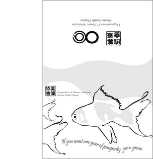
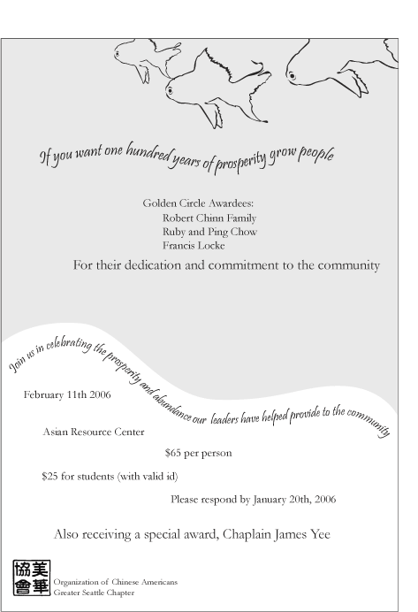
OCA Invitation
I sit on the board of an non-profit called the Organization of Chinese Americans Seattle Chapter. Since I am far from rich and most of my friends are either just as poor if not poorer, one way I contribute is by offering my graphic design skills. The following is an invitation that I designed for our annual dinner in Feb. The fish symbolizes, in Chinese culture, prosperity and abundance (which we will have if you donate lots of money). I'm happy with the theme and graphics because I think they will carry over nicely to the program booklet. I created the illustrations and the copy myself. I chose the following Chinese proverb to tie in the fact that we are honoring members of the community for their contributions and dedication to the community and that we will be asking them for money:
If you want one year of prosperity, grow grain.
If you want ten years of prosperity, grow trees.
If you want one hundred years of prosperity, grow people.

If you want one year of prosperity, grow grain.
If you want ten years of prosperity, grow trees.
If you want one hundred years of prosperity, grow people.

Monday
Christmas Card
The following is a Christmas Card that I designed for T.I. Chen Associates. Doves are pretty well know for being symbols of peace, but they are also non-denominational. As a business person, you don't know if your clients celebrate Christmas, Kwanza or anything at all. So it is pretty safe to go with Happy Holidays and PEACE!


Thursday
Annual Report
I'm very excited to be able to post the link to this
I am very happy with the way this turned out. I think it's eye catching and it really captures the essence of the amazing growth the agency has gone through in the past year.
annual report
that I created. It was my baby as I nursed it through absurd text, gave it a concept and developed the illustrations, photographs, and layout.I am very happy with the way this turned out. I think it's eye catching and it really captures the essence of the amazing growth the agency has gone through in the past year.
Wednesday
Artwork
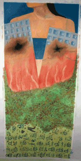
My degree is a Bachelors of Fine Arts and my major was Graphic Design. For the first two years of art school we studied the basics such as drawing, painting, and sculpture. Then the last two we focused mostly on design. (We weren't allowed to use the computer in our first design classes, instead learning the old fashioned way.) I started painting again once I had the space to set up an easel. The following are some of the projects I am working on.
This is a triptych of large pastels in the order they were created. The first started out as an amalgamation of sights from various trips I had recently taken and Seattle and turned into more of an enviromental piece. Using newspapers for buildings made them seem dirty and evoked the damage that large cities can unleash on the enviroment. I explored this theme further in the next pastel. The figure lying down symbolizes that each individual is either a contributer to pollution and enviromental disasters or a protector of nature and ecosystems. The houses in their neat rows symbolize the inorganic way that man sets up his grid and spreads out eating up land. The final piece shows that despite the neatness and perfection of our rows of houses, we find ways to self-destruct. The houses are broken in two and 'milagros' litter the ground like charms for loved ones that will never heal or reappear. In all three the figure serves to remind us that we are all responsible and that even one person can make a difference.


This is a triptych of large pastels in the order they were created. The first started out as an amalgamation of sights from various trips I had recently taken and Seattle and turned into more of an enviromental piece. Using newspapers for buildings made them seem dirty and evoked the damage that large cities can unleash on the enviroment. I explored this theme further in the next pastel. The figure lying down symbolizes that each individual is either a contributer to pollution and enviromental disasters or a protector of nature and ecosystems. The houses in their neat rows symbolize the inorganic way that man sets up his grid and spreads out eating up land. The final piece shows that despite the neatness and perfection of our rows of houses, we find ways to self-destruct. The houses are broken in two and 'milagros' litter the ground like charms for loved ones that will never heal or reappear. In all three the figure serves to remind us that we are all responsible and that even one person can make a difference.


Monday
Brochure Design
The following is a link to a Brochure I designed for a Pharmacy Residency program. Some of the difficulties included balancing a large amount of text with the amount of photographs (which I took with a digital camera) requested. I designed the brochure to appeal to the mature student who has just finished a PharmD (post graduate) program. The result, I believe, is a friendly, accessible brochure with a lot of good information and photographs that draw you in and show the atmosphere of the Pharmacy.
Click here to view the brochure
I've also recently completed a brochure for the Organ Donation Transplantation program. Organ Donation is a tough issue in Asian Communities. Asian cultures, typically, do not like to talk about issues surrounding parts of their bodies. However, studies have shown that if you show it in the light of helping members of their community, they respond well. The brochure was designed to highlight photos of community members and also make the information as non-scary (for lack of a better word) as possible. Also, the bright colors draw the viewer in to pick up the brochure and the illustrations I created are meant to make people feel comfortable about the subject.
Click here to view the brochure
Click here to view the brochure
I've also recently completed a brochure for the Organ Donation Transplantation program. Organ Donation is a tough issue in Asian Communities. Asian cultures, typically, do not like to talk about issues surrounding parts of their bodies. However, studies have shown that if you show it in the light of helping members of their community, they respond well. The brochure was designed to highlight photos of community members and also make the information as non-scary (for lack of a better word) as possible. Also, the bright colors draw the viewer in to pick up the brochure and the illustrations I created are meant to make people feel comfortable about the subject.
Click here to view the brochure
Sunday
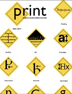
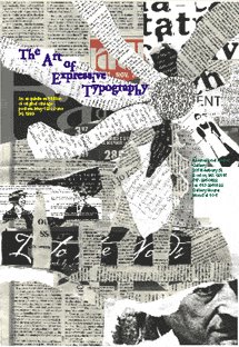
Print Design and Communication
This is a cover I designed for Print Magazine's student design contest. I came up with the concept of communication at its most basic level (traffic signs) because that is, I believe, what graphic design should be all about, communicating a message or concept simply and clearly. The traffic signs in this cover express basic elements of design including leading, serifs etc.

Saturday
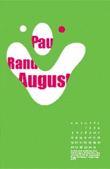
Poster Designs
The following are examples of some posters that I had designed over the years for film festivals, plays, and art exhibitions. In many of them, I used my own images.


Past work
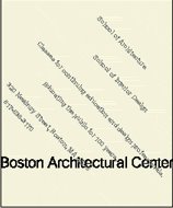
The following are some advertisements I designed for a project on the Boston Architectural Center. The unconventional text creates the illusion of architectural elements and in one stroke draws the viewer into the ad.


Thursday
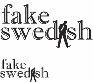
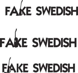
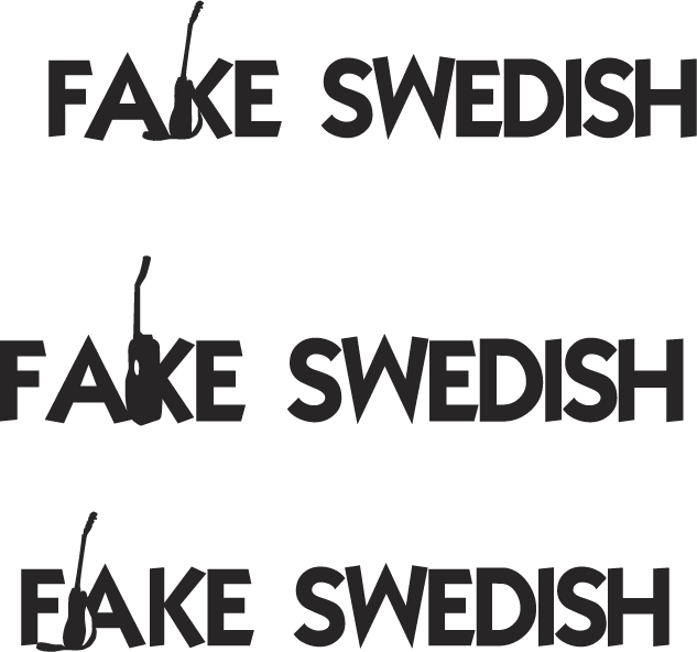
Psychedelic Fake Swedish
Not being tapped into the culture that Fake Swedish reside in, I am having a difficult time with the logo. Previous incarnations were cool, but feedback was that the lead singer is uncormfortable with his image being in the logo (instead of the whole band) and that it is not quite psychedelic enough. He wants something that you can get high looking at. Other logos were too cookie cutter and perfect. Apparently, his fav. image is from the bands website. A local artist made a poster for them with their name in smoke. At first I tried to copy this look, but being a bit of a purist, I was getting stuck on ruining the perfect lines of an established typeface. Weirdly enough I came up with the following idea when researching another logo transition on the IBM website. It gave me an idea that probably would have made the logo artist turn in his grave (assuming he is dead). Here is the image and I'll explain below:

I decided to jump right in with references to smoking anonymous substances. Originally, I started with a stylized bong shape and then jumped to and apple bong. I had to look up on the internet images of apple bongs and then a website that tells you have to make an apple bong. Unfortunately, the people I have shown this to do not recognize it as such. However, they are not into smoking paraphanalia and so that is understandable. I like this logo because it takes something wholesome and turns it into the opposite. When I see pictures of Fake Swedish, the lead singer is wearing a dress shirt and tie. I imagine him, pre-rock show, as a nice, well-dressed young man, someone you can take home to mom. But as soon as he steps on that stage, whatever images you have in your head of him do a 180.

I decided to jump right in with references to smoking anonymous substances. Originally, I started with a stylized bong shape and then jumped to and apple bong. I had to look up on the internet images of apple bongs and then a website that tells you have to make an apple bong. Unfortunately, the people I have shown this to do not recognize it as such. However, they are not into smoking paraphanalia and so that is understandable. I like this logo because it takes something wholesome and turns it into the opposite. When I see pictures of Fake Swedish, the lead singer is wearing a dress shirt and tie. I imagine him, pre-rock show, as a nice, well-dressed young man, someone you can take home to mom. But as soon as he steps on that stage, whatever images you have in your head of him do a 180.
Fun with . . . Organ Donation???
I've been working on a brochure for the Organ Donation and Transplantation program. How do you make organ donation and transplantation interesting? I came up with some fun illustrations and colors in Illustrator and then set them as the background and went from there. The final product of the brochure looks different, but the original idea has inspired me throughout the project. . .


Internet ad
I designed this ad to coincide with the posters (in my first entry) hoping that when the potential applicants for the jobs went to the website, they would immediately know that they were in the right place and that other people viewing the website would be aware that there are job openings. The client liked my initiative and asked for a smaller version so that he could put it in the signature of his email. It is meant to have animation, but I'm not sure blogger allows animated gifs . . .


Wednesday
Poster Design
The following is a poster I designed for a going away celebration for a member of the ID Community. I believe that it was successful at drawing the viewer into the poster and also depicts the person as a rising star and sweetheart of the community.


Thursday
Logo Design
I am currently working on developing a logo for a band called Fake Swedish. Here is what has been said about them:
"working a 60s UK mod/psych thing...we're talking about Rock Music that remembers a time before the fateful pop/rock schism."
-Ross Grady / Chapel Hill Music Scene
and what they say about themselves:
"we are a band that focuses mostly on songs, but we are also not afraid to dive head-first into pyschedelic improv jams. we enjoy flying by the seat of our pants onstage, and we tend to draw comparisons to late 60's psychedelic rock. that's ok with us."
They asked for a "pyschedelic" logo and I am trying to incorporate that with what I hear in their music and from their quirky name. I'm have not arrived at a final solution yet, but like the road I am going down.

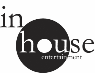
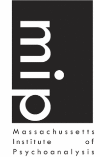
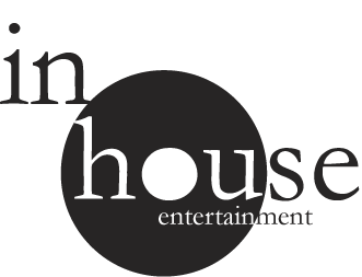
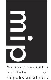
Logos
I've been working on re-designing a logo for my current company recently and wanted to revisit some of the logos that I have done in the past. The two that I am going to post today are both successful in that I believe they convey the feeling of the companies, are striking and eye-catching, and are a touch fun and funky:
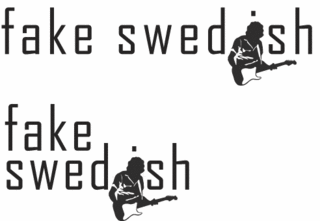
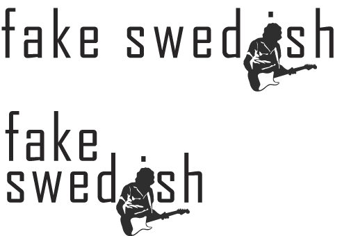
Also, going back to a project I have posted about before, the following is the latest design I have made for the Fake Swedish project. My project manager seems to like this one . . .

Also, going back to a project I have posted about before, the following is the latest design I have made for the Fake Swedish project. My project manager seems to like this one . . .

Wednesday
Recruitment Posters
Having decided that a blog would be the simplest and quickest way to get my work up on the internet, I have a lot of catching up to do. My plan is to update with projects I am currently working on interspersed with projects from the past. Hopefully, you will get an idea of my process and the developement of each piece.
My resume will be posted as some point to the left, but until then, a little about me . . . I studied at Boston University, School of Fine Arts in which I spent half my time on fine arts such as painting, sculpture, drawing etc, and the other half on design. I believe that this balance of education gives me a good perspective on design. Rather than relying on the computer and fancy effects, I approach problems conceptually and develope a solution that fits. Brief, but you will learn more about me later.
Now comes the first dilema, what do I put up first?
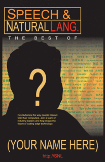
I am particularly proud of the following two pieces that I did for a tech company. The group in charge of this project wanted to play on their name and Saturday Night Live. I developed the first poster with a similar color scheme as some of the Saturday Night Live dvd covers and posters and carried that through to the second poster. By using sillouettes of people rather than an actual photo, not only is it graphically striking, but it allows the viewer to imagine him/herself as a member of the team. The writing in the background, in sanskrit, japanese, chinese, spanish etc, alludes to the diversity of the group.

My resume will be posted as some point to the left, but until then, a little about me . . . I studied at Boston University, School of Fine Arts in which I spent half my time on fine arts such as painting, sculpture, drawing etc, and the other half on design. I believe that this balance of education gives me a good perspective on design. Rather than relying on the computer and fancy effects, I approach problems conceptually and develope a solution that fits. Brief, but you will learn more about me later.
Now comes the first dilema, what do I put up first?
I am particularly proud of the following two pieces that I did for a tech company. The group in charge of this project wanted to play on their name and Saturday Night Live. I developed the first poster with a similar color scheme as some of the Saturday Night Live dvd covers and posters and carried that through to the second poster. By using sillouettes of people rather than an actual photo, not only is it graphically striking, but it allows the viewer to imagine him/herself as a member of the team. The writing in the background, in sanskrit, japanese, chinese, spanish etc, alludes to the diversity of the group.


Subscribe to:
Posts (Atom)